Showing 3 results
AP STATISTICS
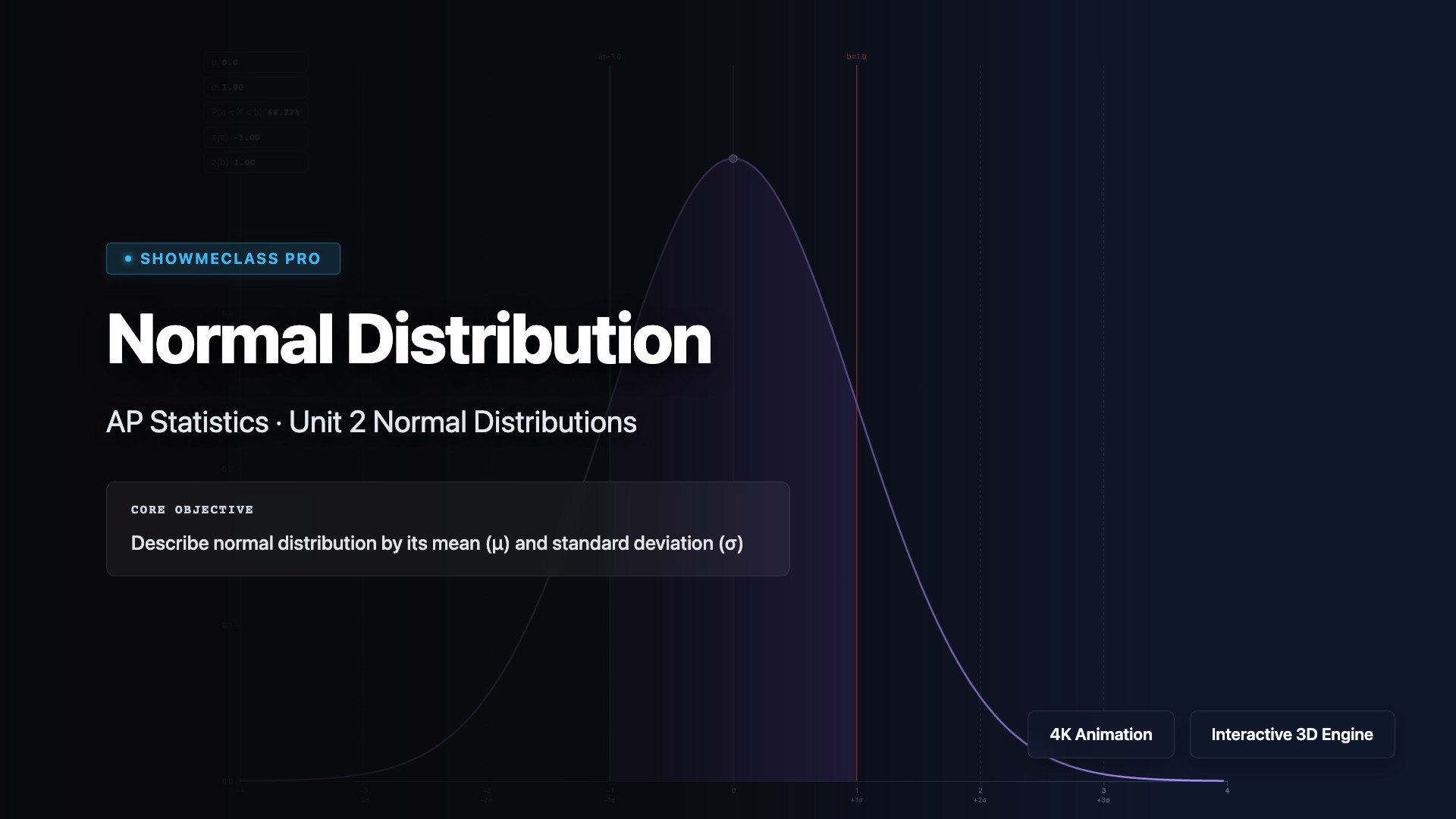
Normal Distribution Explorer
Adjust mean and standard deviation to see how the normal distribution bell curve shifts and stretches. Shade probability regions to compute areas under the curve and connect z-scores to percentiles.
AP STATISTICS
Normal Distribution Explorer
Interactive Gaussian curve generator manipulating $\mu$ and $\sigma$ instantly mapped against the 68-95-99.7 Empirical Rule. Highlights discrete $Z$-score thresholds tracking precision standard deviation geometry exactly.
AP STATISTICS
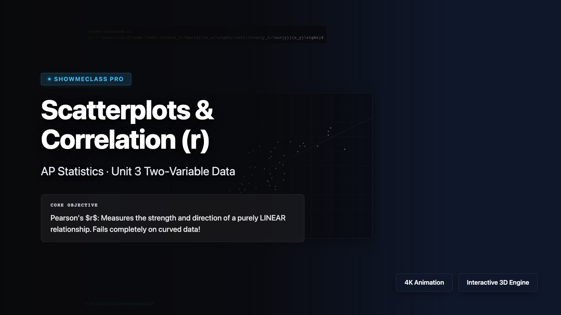
Scatterplots & Correlation (r)
Interactive scatterplot geometry demonstrating Pearson's correlation coefficient mapping bounds ($|r| \to 1$). Employs bivariate normal Box-Muller transformations to visually generate dynamic density clouds calculating $R^2$ determination variances overlaid mathematically on LSRL projection planes natively.